
Reading time: Less than 3 minutes
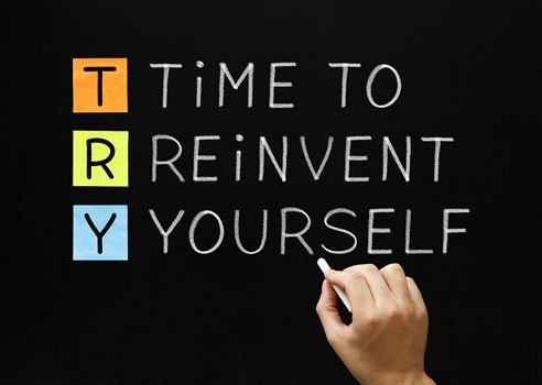
Change can be both exciting and difficult. I confess I’ve held both feelings as I’ve worked on my website redesign…
When I was features editor at a large metropolitan daily newspaper — this was in my previous life — I had one experience I will never forget.
It was about 1987 and we changed the design of our television magazine. We didn’t do this quickly or lightly. At the time, the cable TV industry had exploded, dramatically increasing the number of channels or stations that needed to be listed. Our old grid just wasn’t going to work anymore. We had to do something new.
A team of graphic artists sweated over a large number of different designs. Then, we took these mock-ups to focus groups in malls and contacted readers by phone. We even prepared our readers with an advertising campaign beforehand.
And when we launched the redesigned product? Crisis! I’m both slightly proud and deeply embarrassed to report that the number of complaints we received — 10,000 on the first day — broke our telephone switchboard for a few hours. As a senior editor I couldn’t get any work done. I was forced to spend three days simply calming down angry customers.
Here’s one conversation that left me blindsided: One woman called to say: “My husband died. I just returned home from the funeral. And now….this [referring to our magazine.]” How could a TV magazine be on par with a death in the family, I wondered. But I learned the hard way how much people dislike change.
Thus, I have some trepidation as I point out that I’ve just released a redesign of my website. (If you’re still seeing this post on the old one, or if the site looks broken, please be sure to refresh — Command + R — and clear your cache. If you don’t know how to do this, ask Google how, mentioning the name of your browser — i.e. Internet Explorer, Firefox, Chrome etc.)
First, let me emphasize that it’s an evolutionary, rather than a revolutionary change. The background colour is the same. The photos of me are the same (I’ll update them later.) And the navigation is in exactly the same place.
So, why did I do it? Five main reasons:
First, I’m not just the Publication Coach. I’m also Gray-Grant Communications. My old website didn’t convey that message terribly effectively. You’ll notice that I have two new categories in the navigation bar: Products and Services. The former outlines the wares I’ve been delivering to my blog readers for a number of years — my book, my year-long course, Extreme Writing Makeover, my Get It Done program for book and thesis writers and my one-on-one coaching.
The latter — new — category, however, addresses the kinds of services I provide for big companies, non-profits and solopreneurs: writing and editing, training, communications consulting and crisis communications.
Second, I found the top of my old page to be a bit old-fashioned. I wanted a cleaner, more up-to-date look. I’m very happy with the job graphic artist Warren Clark, has done with my new header. Thanks for the great work, Warren; you’re delightful to work with.
Third, I wanted a stronger home page — one that directed readers more clearly to my Power Writing newsletter AND to my no-charge booklet on mindmapping. I’ve had a bounty of new subscribers recently (a warm hello to the several thousand Coursera followers who signed up in January). Now I’m all set to welcome even more new readers.
Fourth, I wanted a site people could read on their cellphones and tablets. My new site is mobile friendly. At last! (My son has been lecturing me about this need for ages.)
Finally, I wanted photos to have a bigger impact. The size of photos in my blog has now more than doubled (for any tech heads reading I can tell you that the width has gone to 492 pixels from a previous 240.)
All of these changes and adjustments have kept me, and my technical support team very busy over the last eight weeks. (Why did we do this over Christmas? That’s a question I wish we’d asked earlier!) I might not have survived the process without the calm, steady hand of my webmaster, Matt Beswick, from Hidden Pixel Web Design. That he lives in London, England presents a tiny time-zone challenge. But he’s kind, patient and professional. And I thoroughly enjoy listening to his hybrid Stoke-on-Trent/Cheshire accent. Thanks, Matt!
Please let me know what you think about the redesign in the comments section below. If you’re having trouble with the new look, try to imagine what it would be like to repaint your house. Every time you looked at it, you’d get a bit of a shock because it appeared so different. Gradually, as time wore on, however, you’d become more and more accustomed to it and you’d stop noticing the differences between the old paint job and the new one.
Before you knew it, it would be time to repaint the house again! Don’t worry. I hope to keep things as they are now for the next three or more years. In the meantime, I welcome your feedback.
What do you think of my new website? And how do you deal with change? We can all help each other so please share your thoughts with my readers and me, below. If you comment by January 31, 2015 I’ll put your name in a draw for a no-charge copy of the non-fiction book, Writing Bullets. If you don’t see the comments box, click here and then scroll to the end.