Reading time: Just over 1 minute
Here’s why your company needs to stop worrying about “pretty” and start concerning itself with readability…
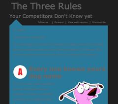
Look at the graphic I’ve attached to this post. Can you READ it? I mean, beyond the attention-getting headline saying The Three Rules Your Competitors Don’t Know Yet.”
Even though the email version of this graphic was enormous, I still couldn’t read the three rules. That’s because they are listed in grey type on a blue background. My eyes buzz, when they look at this, but they don’t discern. (In the small size shown above, you can probably barely tell that there’s any type at all on the blue part of the page. But there is. It’s just unreadable.)
The pink dog (or is it a pig?) is cute but because I can’t read the words around it, its cuteness has no impact on me.
Who’s to blame for this imbroglio? I lay the fault at the door of the graphic designer. Note: I don’t cast aspersions on all graphic designers when I say this. I’ve been lucky enough to work with exceptionally talented designers over the years. But the best ones, I find, are less concerned about making something look “pretty” and more worried about whether the published work is readable.
Readability should be your number 1 goal. Someone in your company or organization should always check your graphics to ensure they’re readable. This means:
- no “reverse” (white type on a coloured background, which is hard to read)
- not too many italics (they’re hard to read)
- not too much boldface (ditto)
- not too much super-wide copy (ditto)
- no type above headlines (confusing)
- no hard-to-read colours (see photo, above.)
It’s too bad that someone spent time and money on this graphic because I can guarantee that almost no one was able to read it.

