
Reading time: Less than 1 minute
Writers should occasionally cede control to graphic artists, particularly when it comes to visual elements such a logos. Here’s an example from the company Ballet BC…
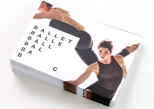
I don’t think about logos very much. Until I see one I really like. The dance company Ballet BC now has one of my all-time favourites.
See it above and look at the way it creates a strong sense of movement. Examine the first line and the last — it spells out Ballet BC. Look at the way the third and the last line give you the very beginning of the alphabet, ABC. Consider the relationship between a soloist (here, the letters B and C) and a troupe (the rest of the letters.)
As a writer who is pretty hopeless with design I was intrigued to understand more about how a graphic artist could achieve such comfort with words and letters. I phoned Ballet BC and learned who had designed the logo — a Vancouver agency named Burnkit. And the person in charge? Chris Allen.
“Our studio is pretty typographic in what we create,” he told me in a telephone interview. “It’s simple messaging but with big nuances.” Here he points to the sense of movement the letters achieve and he also mentions something that hadn’t even occurred to me: Dancers repeat the same exercises every day, countless times. The repetition of the word “Ballet” in this logo represents that discipline.
Allen says that in developing the logo he and his team generated a “wall full” of ideas and this is the one the client picked. “The biggest objective of the rebrand was to have a logo that reflected the contemporary nature of a world class dance company,” he says. They’ve certainly achieved that.
Does your company have a logo that expresses your world view? Your hopes and dreams? If not, it might be time to get someone working on it.